Well, we all know about bold rebranding of Uber. The Uber you know and love is getting a wardrobe change. We know the first question everyone’s going to ask.
“We love the Uber icon! Why the f*%k are you changing the BIG Elegant U??!!” or “What happened to my big black, lovable dashing U.
Uber explained in its blog,
there are many reasons for the change, but the most important is that One of the big changes over the years is that Uber no longer moves just people; we’re now moving food, goods, and soon maybe much more. With the potential for many apps with many app icons, we needed one approach that connected them all.
But many feel the new design of Uber Logo is not that good, it looks weird and not so cool. Looking the feedback on the internet, we did some research on Uber Logo history and to help in this Red Kite Design company supported our research and find out that this is the fourth logo Uber has designed and used during its journey.
Uber First & Second Logo
When Uber was started in 2010, Garrett Camp, co-founder and graphic designer Uber, spent a couple hours in photoshop designing a logo for UberCab. He made a ‘U’ for the Uber, and turned it around for the ‘C’.
In October 2010, a few months after Uber launched, there were still only 5 employees. Uber received nastygram (aka, a Cease and Desist) from the city of San Francisco saying amongst other things, that our name UberCab means we are marketing ourselves as a cab company.

Uber responded within 24 hours by changing its name to Uber, and thus logo changed with it. Ryan McKillen, Uber’s 2nd full-time engineer, went into photoshop and took the big red ‘C’ off. Conrad Whelan was the most eloquent about the change, “We were always Uber, but now it’s official!”
Uber Third Logo (The most famous and Elegent Logo)-
The primary guiding principle in designing the third logo was to find an identity that most closely represents Uber riders’ experience when using Uber. Now obviously everyone has a different perspective, but there are common threads.
Some words that came to users mind using Uber: Distinguished, Efficient, Elegant, Convenient, Modern, Luxurious, Quality, Service, Baller, Like-Woah.
Is it luxury? Well, not quite, but maybe “grounded” luxury, or what Uber call “vulnerable luxury”.
Uber founders feel that our service is very good, but it still is not perfect and has its flaws. They didn’t want to float above water looking down on everyone who tried to approach us. Instead, it’s luxurious, but has its quirks, and its panache and is intended to have a level of approachability.
A new app icon
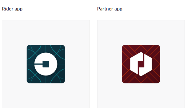
Uber no longer moves just people; now also moving food, goods, and soon maybe much more. With the potential for many apps with many app icons, Uber needed one approach that connected them all. So Uber came back with new design.
In the new Uber logo, you’ll see that both rider and driver icons have the bit at the center, and then the local colors and patterns in the background. This is a framework that will also make it easy to develop different icons for new products over time.

Uber Press Statement-
Uber started out as everyone’s private driver. Today we aspire to make transportation as reliable as running water, everywhere and for everyone. Our new brand reflects that reality by working to celebrate the cities that Uber serves. We’re excited to share it with you. And oh yes… hopefully this haircut lasts a bit longer than the last 🙂

