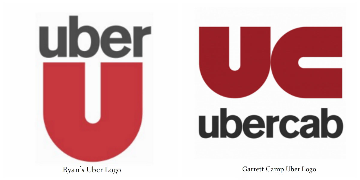
Exclusive – This is The Fourth Time Uber Has Been Changed It’s Logo
Well, we all know about bold rebranding of Uber. The Uber you know and love is getting a wardrobe change. We know the first question everyone’s going to ask.
“We love the Uber icon! Why the f*%k are you changing the BIG Elegant U??!!” or “What happened to my big black, lovable dashing U.
Uber explained in its blog,
there are many reasons for the change, but the most important is that One of the big changes over the years is that Uber no longer moves just people; we’re now moving food, goods, and soon maybe much more. With the potential for many apps with many app icons, we needed one approach that connected them all.
But many feel the new design of Uber Logo is not that good, it looks weird and not so cool. Looking the feedback on the internet, we did some research on Uber Logo history...

